What mobile-first navigation actually means for service sites
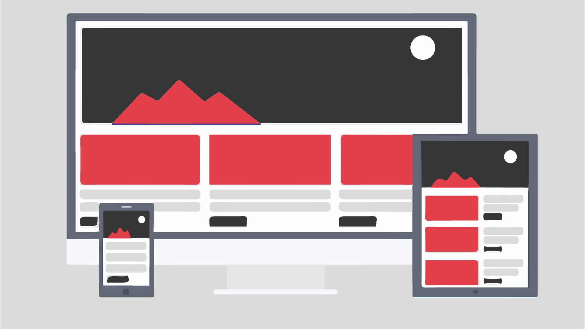
Mobile-first navigation means designing your menu, calls to action, and wayfinding for a small touchscreen before you think about the desktop version. For service websites specifically, that translates to making it dead simple for a visitor on their phone to find what you do, understand your offer, and reach you — in under three taps.
That sounds straightforward. In practice, it flips the typical design workflow on its head. Most service websites still get designed on a wide-screen canvas and then scaled down to mobile as an afterthought. The result is navigation that technically fits a phone but was never really built for one — cramped menus, dropdowns that are painful to tap, and a 'Contact Us' link buried at the bottom of a hamburger nobody opens.
It's a strategy, not just a layout tweak. It forces you to decide — before a single pixel is placed — which destinations actually matter to a mobile visitor. For a home-services company, that might be 'Get a Free Quote' and 'Service Areas.' For a B2B consulting firm, maybe it's 'What We Do' and 'Book a Call.' That discipline of choosing upfront is what makes the navigation genuinely useful rather than just functional.
If you want the full strategic context, our guide to UX design for service businesses covers how navigation fits into a broader user-experience architecture.
Why your current nav is probably costing you leads
Here's a scenario we run into constantly: a service business invests in paid search, drives solid traffic, and then watches their inquiry rate stay stubbornly low. Nine times out of ten, the culprit isn't the ad copy or the landing page headline — it's friction in the navigation. Mobile friction specifically.
Think about how people actually search for local or specialized services. They pull out their phone, run a quick search, tap a result, and spend about fifteen seconds deciding whether to stay or hit back. If the first thing they hit is a wall of text, a hamburger menu that opens slowly, or a 'Request a Quote' button that's two full scrolls down the page, they leave. Not because they weren't interested. Because you made the next step feel like work.
We've watched clients cut their inquiry drop-off noticeably just by moving their primary CTA out of the hamburger menu and into a sticky header bar. No new copy, no redesign — just making the action accessible without requiring the user to open the menu at all. That one change can matter more than weeks of copy optimization.
The stakes are especially high for service businesses because you're almost always competing against directories, aggregators, and national brands with full UX teams. If a visitor can get a quote from a competitor in two taps, your beautiful full-width desktop hero isn't going to save you.
The core mobile nav patterns that work for service businesses
Not all mobile navigation patterns are equal, and the right choice depends on how many services you offer and how much content you need to surface. Here are the patterns we reach for most often when working with US service businesses:
- Sticky header with exposed CTA: A slim, always-visible bar at the top containing your logo and a single action button — 'Get a Quote,' 'Book Now,' or 'Call Us.' This keeps the most important action reachable at all times without requiring the user to scroll back up or open a menu.
- Bottom navigation bar: Borrowed from native apps, this places three to five icon-and-label tabs at the bottom of the screen where thumbs naturally rest. Works especially well for service sites with distinct sections — Services, About, Blog, Contact. Users find it intuitive because it mirrors the apps they already use every day.
- Full-screen overlay menu: When a user taps the hamburger, the entire screen becomes the menu. This gives you enough room to show services, sub-pages, and a secondary CTA without the cramped feel of a traditional dropdown. Fast animation and an easy close target are non-negotiable here.
- Priority+ pattern: Show your top two or three nav items as text links in the header, and collapse the rest behind a 'More' button. This surfaces your most-visited pages without forcing the hamburger on every user.
For most service businesses with five to eight pages, a sticky header with an exposed CTA paired with a full-screen overlay for secondary navigation hits the sweet spot. It's clean, it converts, and it doesn't require complex development work.
Where to put your primary CTA in a mobile nav
This is the question that generates the most debate in our design reviews. Here's a practical framework to settle it.
Rule one: the CTA must be visible without any interaction. If a user has to tap the hamburger menu to find your 'Contact' or 'Get a Quote' link, a meaningful share of visitors will never see it. Your primary CTA belongs in the persistent header, full stop.
Rule two: one CTA per navigation context. Some clients want a phone number, a 'Book Now' button, and a 'Get a Quote' link all in the header. That creates decision paralysis. Pick the single action that's most valuable to your business and champion it. Secondary options can live inside the full menu.
Rule three: match the label to what the visitor is actually ready to do. 'Contact Us' is vague. 'Get a Free Estimate' or 'Check Availability' sets expectations and feels specific. The clearer the button communicates what happens next, the higher your tap rate will be.
Rule four: consider a floating bottom CTA on long scroll pages. On service description or case study pages, a persistent button anchored to the bottom of the viewport — separate from the top nav — acts as a constant nudge without being intrusive. It works particularly well on mobile because the thumb naturally hovers near the bottom of the screen.
Also worth reading: our breakdown of form UX patterns that increase submissions — because once someone taps your CTA, the form experience is what closes the deal.
What are the most common mobile navigation mistakes on service sites?
A pattern we keep running into when auditing service-business websites: the same errors, over and over, regardless of industry or company size. Here's the straight list:
- Tiny tap targets: Links and buttons under 44x44 pixels are genuinely hard to tap accurately on a phone. This isn't a style issue — it's a usability failure that frustrates real users in real moments.
- Phone numbers as plain text: If your number isn't wrapped in a
tel:link, mobile users can't tap to call. One of the easiest wins on any service website, and one of the most commonly missed. - Dropdown menus that require hover: Hover states don't exist on touchscreens. If your navigation relies on hovering to reveal sub-menus, those sub-pages are effectively invisible to anyone on a phone.
- Too many top-level items: Trying to surface every service, every sub-service, and every informational page in the main nav overwhelms users. If your mobile menu has more than five or six items, that's an information architecture problem — not a design one.
- No visual hierarchy: When every menu item looks identical — same font size, same weight, same color — users can't quickly identify where to go. High-priority links should look more prominent than secondary ones.
- Slow menu animation: A hamburger menu that takes more than 200–300 milliseconds to open feels sluggish. Users will tap it again thinking it didn't register, which causes it to close. Speed matters more than you'd expect.
- Hiding the logo: Some sites shrink or drop the logo entirely on mobile to save space. Keep a small version. It reinforces trust and helps users reorient themselves when they're deep in the site.
Do service websites need mega menus on mobile?
Short answer: almost never.
Mega menus — those wide, multi-column dropdown panels — exist to handle complex navigation on large desktop sites. E-commerce platforms and enterprise software portals use them because they genuinely have hundreds of categories to surface. The benefit is real in that context. Service businesses are a different story.
Even a mid-size agency or consulting firm rarely has more than ten to fifteen pages that matter to a buyer. Trying to replicate a mega menu structure on mobile creates a cluttered, slow, visually confusing experience that sends people to the back button.
What service sites actually need on mobile is depth without clutter. The pattern that works: a clean top-level menu with grouped sections — 'Services,' 'Industries We Serve,' 'Company,' 'Resources' — where each section expands on tap to reveal sub-items. This accordion approach gives users access to the full site architecture without dumping everything on them at once.
The one scenario where something close to a mega-menu concept makes sense on mobile is when you have distinct service lines that require immediate differentiation — say, a firm that handles both residential and commercial work and needs to route those two audiences into separate funnels right from the nav. Even then, the solution is usually two prominent top-level links with icons, not a mega menu.
Keep it simple. Mobile users are goal-driven and impatient. The more choices you present simultaneously, the slower their decision-making gets. A clear, shallow navigation hierarchy will consistently outperform a comprehensive but complex one.
How to test your mobile navigation without a big budget
You don't need a usability lab or a hefty research budget to find out whether your mobile nav is working. Here are practical methods any US service business can actually use:
- The five-second test: Show someone your mobile homepage for five seconds, then hide it. Ask them: what does this company do, and what would you tap next? If they hesitate on the second question, your nav isn't doing its job. Tools like Lyssna let you run this remotely for a small fee.
- Scroll-depth and heatmap tools: Free or low-cost tools like Microsoft Clarity or Hotjar show you where mobile users tap, how far they scroll, and where they drop off. If your navigation items are getting zero taps, that tells you something important about whether users are even engaging with your menu.
- Ask your front-line team: Your sales reps or customer-service staff hear firsthand what questions new leads ask before they reach out. If people frequently call about something that's answered on your website, they couldn't find it. That's a navigation problem wearing a customer-service costume.
- Personal device testing: Pull up your own site on three different phones — yours, an older Android, and a friend's device. Navigate as if you're a first-time visitor trying to request a quote. You'll spot friction points immediately that you'd never catch on a desktop browser.
- A simple task-completion test: Ask five to ten people to complete one task on your mobile site — 'find out if this company serves your area' or 'figure out how to get a quote.' Watch without guiding them. Where they hesitate or give up is exactly where your navigation needs work.
None of these methods are expensive. All of them surface real problems. The goal isn't a perfect research study — it's to find the two or three friction points actively costing you inquiries and fix those first.
Putting it all together: a simple action plan
Mobile-first navigation doesn't have to mean a full redesign. For most service businesses, meaningful improvement comes from a focused series of targeted changes. Here's a sensible sequence:
Week one — audit what you have. Pull up your site on your phone. Document every friction point: buried CTAs, hover-dependent menus, tiny tap targets, plain-text phone numbers. If you want a structured approach, our UI/UX audit checklist for founders walks you through exactly how to do this in an afternoon.
Week two — fix the highest-impact issues first. Turn your phone number into a tappable tel: link. Move your primary CTA into a sticky header. Increase tap-target sizes on all navigation links. These changes are typically low development cost and high conversion impact.
Week three — rethink your information architecture. Check your analytics and identify which three to five pages drive the most conversions or receive the most traffic. Those are your top-level nav items. Everything else goes one level deeper, accessed through an accordion or full-screen overlay menu.
Week four — test and iterate. Run a simple task-completion test with a handful of real users. Use a heatmap tool to watch how mobile visitors interact with your updated navigation. Make adjustments based on what you observe, not what feels right on paper.
The pattern we see over and over: service businesses that treat mobile navigation as a strategic priority — not an afterthought — consistently see stronger lead flow from both organic and paid traffic. It's one of the highest-leverage UX investments you can make without touching your brand, your offer, or your ad spend.
Want a mobile navigation review built around your specific service business?
At Xulum, we've been helping US service businesses turn mobile visitors into actual leads since 2009. If your current navigation is making people work too hard to contact you, we can pinpoint exactly where the friction is and show you what to fix first. Tell us a bit about your site and we'll put together a tailored assessment — no generic templates, no sales deck.
Request your quote →