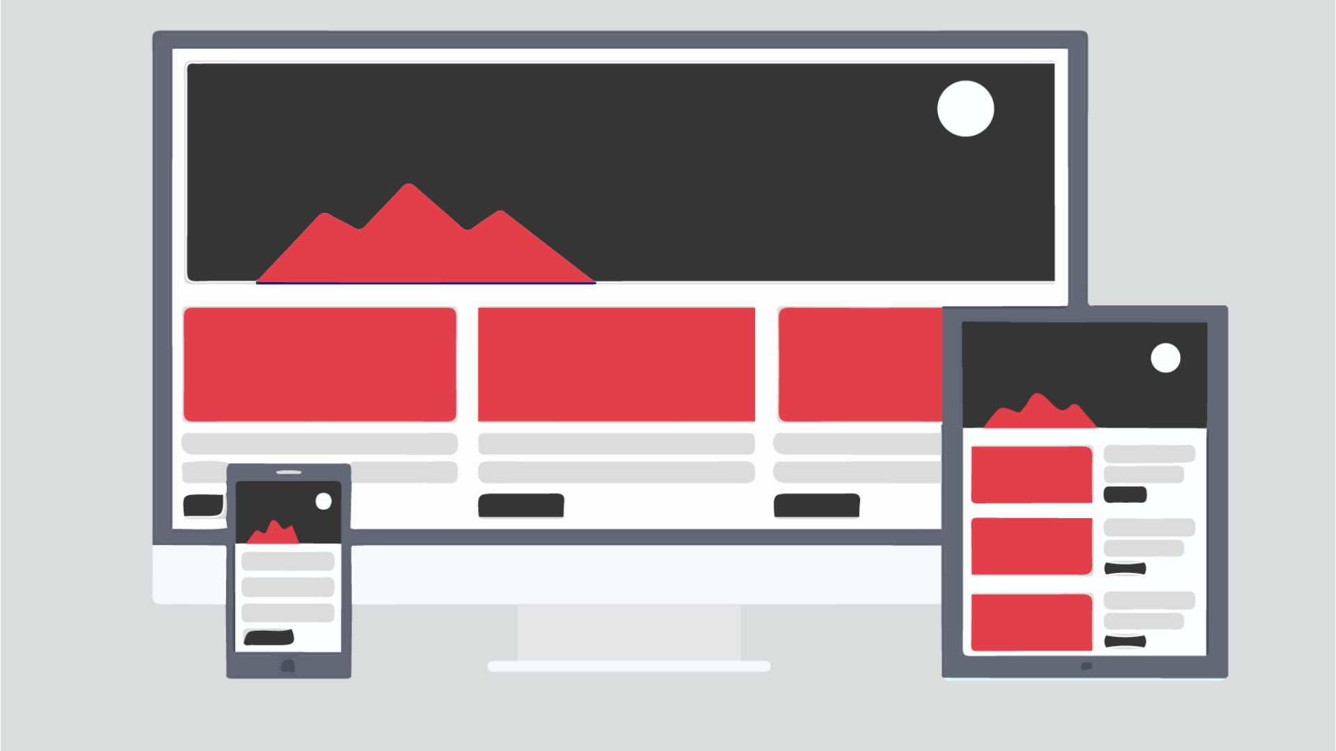
What UX design means for travel and tourism websites
UX design for travel and tourism sites is about structuring every page, interaction, and decision point so visitors move confidently from inspiration to confirmed booking. Done right, it removes friction, builds trust fast, and makes the path to purchase feel obvious rather than effortful.
That definition matters because travel is an emotionally loaded purchase. Someone booking a family trip to Costa Rica or a boutique wine tour in Napa isn't just comparing prices — they're imagining an experience. If your website feels clunky or slow, that emotional momentum dies before they ever reach checkout. And unlike an impulse buy, a travel purchase that stalls rarely comes back.
Here's the thing most operators don't realize: they're not losing visitors because of a bad product. They're losing them to avoidable UX problems. Unclear navigation. A booking form that asks for too much too soon. Photos that won't load on a phone. No clear next step after someone lands on a tour page.
This guide covers the specific UX decisions that matter most for tourism companies — from small adventure outfitters to regional destination marketing organizations. Each section targets a real problem we see in this vertical, along with the practical fixes that actually help.
Fixing the booking flow: where visitors drop off
The booking flow is the highest-leverage area of any travel site. It's where intent turns into revenue — or doesn't. Working with tourism clients, we've watched the biggest drop-offs happen not at the pricing step, but earlier: when the form asks for information visitors aren't ready to share, or when the steps ahead feel murky.
A few principles that consistently help:
- Show progress explicitly. A simple 'Step 2 of 3' indicator reduces abandonment because it manages expectation. Visitors don't quit a process they can see the end of.
- Ask for the minimum viable information first. Don't lead with passport details or full guest information on step one. Ask for dates and group size, confirm availability, then collect personal details. Front-loading the form feels like an interrogation.
- Keep the price summary visible. As someone moves through a multi-step booking, keep a condensed summary on screen — destination, dates, total. It prevents second-guessing and back-button behavior.
- Offer a 'hold my spot' or 'save and continue' option. Travel purchases often involve a spouse, a partner, or a budget conversation. Forcing someone to finish everything in one session means losing a real share of qualified buyers who just needed more time.
- Confirm clearly and immediately. The post-booking confirmation page and email are underrated UX real estate. They should reassure, summarize the itinerary, and tell the customer exactly what happens next — not just display an order number.
One pattern we keep coming back to with clients: treat the booking flow like a conversation, not a form. Each step should feel like a natural next question, not a gate you have to get through.
Why mobile-first is non-negotiable in tourism
Travelers browse on their phones constantly — during lunch, on the couch, waiting at the gate. A substantial share of travel research happens on mobile even when the final booking happens on desktop. That means a poor mobile experience doesn't just cost you mobile conversions; it erodes the trust of visitors who plan to come back later on a bigger screen.
Mobile-first UX in travel isn't simply making a desktop site 'responsive.' It means designing the core experience around a small screen and touch interactions from the start. Here's what that looks like in practice:
- Tap targets sized for thumbs, not cursors. Date pickers, filter checkboxes, and 'Book Now' buttons need to be large enough to tap without frustration. Tiny controls signal an outdated site before the visitor even reads a word.
- Fast load times above everything else. High-resolution destination photos are essential for inspiring travelers, but they have to be optimized. Uncompressed images are one of the most common speed killers we see on tourism sites. Use modern formats, lazy loading, and proper sizing.
- Streamlined navigation. On mobile, a mega-menu is a usability disaster. Prioritize the actions a visitor most likely wants — search tours, check availability, contact us — and make those the center of the mobile experience.
- Click-to-call and chat accessibility. Mobile visitors who hit a question want a fast answer. A visible phone number, a lightweight chat widget, or a WhatsApp link can save bookings that would otherwise just disappear.
Test your site on an actual phone, not just a browser's responsive preview. The experience is meaningfully different, and you'll catch problems that a desktop emulator won't show you.
Trust signals that actually move travelers to book
Travel is a high-stakes purchase. Visitors are handing over real money — often several hundred to several thousand dollars — for something they can't physically evaluate before they buy. If your site doesn't make them feel confident, they'll find one that does. Simple as that.
Trust in travel UX isn't just about a padlock icon in the browser bar. It's the accumulation of signals throughout the experience that communicate: we're real, we're good at this, and you're not taking a risk here.
What actually builds trust on tourism websites:
- Real, identifiable reviews. Not a generic star rating — reviews with names, dates, and specific details. Google Reviews embedded on the site, or a verified widget like Tripadvisor, carries more weight than testimonials you wrote yourself.
- Photos of real customers. User-generated content, even at lower resolution, outperforms polished stock photography for building trust. If guests are sharing photos and willing to give permission, use them.
- Clear refund and cancellation policies. 'What if something goes wrong?' is one of the biggest anxiety points in any travel purchase. Address it proactively and plainly. Don't bury the policy in a footer PDF nobody will find.
- Named, visible team members. A real person's name, title, and photo on a 'Meet your guide' or 'About us' page does more for credibility than almost anything else on the site. People book experiences with people, not brands.
- Recognizable associations and certifications. Tourism board memberships, safety certifications, and industry affiliations — ASTA, USTOA, local chambers — belong on your site in the header or footer, not buried on an about page.
We've watched clients meaningfully improve conversions simply by surfacing trust information that already existed on their site. It just wasn't visible where decisions were actually being made.
Does your search and filter experience hold up?
For tourism sites with more than a handful of offerings — a regional tour operator, a travel platform, a destination marketing site with dozens of experiences — search and filtering is where UX either earns its keep or becomes the reason people leave.
The core problem we keep running into: search and filter tools are designed around the operator's internal catalog logic, not around how a traveler actually thinks. Someone looking for 'something outdoors for two adults and a teenager, about four hours, not too strenuous' doesn't know your product categories. They need a filter system that matches their mental model, not your database schema.
Practical improvements worth prioritizing:
- Use traveler-language filter labels. 'Difficulty: Easy, Moderate, Challenging' beats 'Category: Level 1, Level 2, Level 3.' Describe the experience from the traveler's perspective, not the operator's.
- Support multi-select filters without page reloads. Every time a filter choice triggers a full page reload, you lose a slice of users. AJAX-based filtering that updates results instantly keeps people moving.
- Show result counts per filter option. Letting someone see '14 tours available' next to a filter before they click it reduces dead-end results pages — a common frustration that sends people back to Google.
- Build a smart 'no results' page. When search returns nothing, don't just say 'no results found.' Suggest adjacent dates, nearby experiences, or a contact option. A dead end is a lost booking.
- Make the search bar prominent and functional on mobile. A hidden or hard-to-reach search bar on smaller screens means visitors give up before they've even started exploring.
Making visuals and content do real work
In travel, visuals aren't decoration — they're the product preview. A hotel can't let you sleep in the bed before you book; a tour operator can't let you hike the trail. Photography, video, and written content are the closest thing to a product demo that travel businesses have. That's not a small responsibility.
But strong visuals don't just mean high production value. They mean the right content placed at the right moment in the decision journey.
Visual UX that converts in travel:
- Hero images should answer 'is this for me?' — not just look beautiful. A photo of a couple in their sixties kayaking speaks directly to one segment; a shot of a family with kids speaks to another. Generic 'gorgeous sunset' shots serve no one in particular.
- Video walkthroughs outperform photos for accommodation and complex tours. A 60-second tour of a lodge room or a short highlight reel of a multi-day itinerary reduces uncertainty more than any written description can.
- Sample itineraries belong on the page, not in a downloadable PDF. PDFs create friction and don't index in search. Publish itineraries as on-page content and you capture long-tail search traffic while making the UX better at the same time.
- Write descriptions that anticipate questions. What should I wear? Is this accessible for people with limited mobility? What's included in the price? Answer these inline, before visitors have to contact you to ask.
If you want a closer look at how content decisions interact with bounce behavior, our piece on reducing website bounce rate through better UX covers the mechanics in more detail.
Treating UX as an ongoing process, not a one-time project
One of the most common — and costly — mistakes tourism companies make with UX is treating it like a website redesign: you do it, you're done, you move on. Travel markets shift, booking behavior changes, and your own offering grows. A UX that worked well two seasons ago may be quietly leaking revenue right now.
The better model is building a lightweight, ongoing UX practice. Even for a small team with limited resources, it doesn't require a dedicated researcher. It requires a habit of looking at what visitors actually do, and acting on it.
A starter framework for continuous UX improvement in tourism:
- Set up session recording on key pages. Tools like Hotjar or Microsoft Clarity (both have free tiers) let you watch anonymized recordings of real user sessions. Watching someone struggle with your booking form is more instructive than any analytics report.
- Track drop-off points in your booking funnel. If you know the majority of visitors who start a booking abandon at step two, you have a specific problem to solve. Without funnel tracking, you're guessing.
- Run one small A/B test per season. You don't need enterprise software to test whether a different CTA label or a reordered booking form performs better. Even modest, consistent testing builds institutional knowledge over time.
- Talk to your customers. Post-trip surveys, front-desk conversations, and review responses are a goldmine of UX insight. The complaints guests share with your staff — but never post publicly — are often the most actionable ones.
- Schedule a UX audit annually. Have someone outside your team walk through your site fresh — an agency, a freelance UX specialist, even a usability-aware colleague. Familiarity blinds internal teams to friction that's obvious to an outsider.
Our broader work in UX design strategy for digital businesses is built on this iterative model — because one-time fixes rarely compound the way ongoing optimization does.
Want to know where your tourism site is losing people?
If anything in this guide sounds familiar — a booking flow that loses people halfway through, a mobile experience that was never really designed for mobile, trust signals buried where no one sees them — let's talk through it. The Xulum team works closely with tourism and travel businesses as a nearshore partner. That means fast collaboration, US-market fluency, and real UX expertise without the overhead of a large domestic agency. Tell us about your site and where you think it's falling short. We'll take it from there.
Request your quote →