Yes — Specific UI Patterns Build Trust Before a Visitor Reads a Word
Before anyone reads your headline, their brain has already decided whether the site feels safe. Visual cues, layout logic, and familiar conventions do that work in seconds — and either pass the test or fail it. Clear navigation, consistent spacing, recognizable trust signals, and fast load behavior are what tip the scales.
Here's a concrete example. A potential customer in Cincinnati is searching for a local HVAC contractor. She lands on two sites. The first has a cluttered header, three pop-ups, and stock photos she's seen on a dozen other pages. The second has a clean nav, a real team photo, a phone number in the top right, and a few Google review snippets. She calls the second one — probably without reading much else. She didn't analyze the design. She felt it.
That feeling is engineered. Here's how.
- Persistent, visible contact info: A phone number or email in the header communicates accountability. It tells visitors someone real is behind this site.
- Consistent visual hierarchy: When headings, body text, and CTAs follow a clear size-and-weight system, the site reads as professional — not thrown together at the last minute.
- Above-the-fold clarity: Visitors should understand what you do, who you serve, and what to do next without scrolling. Ambiguity kills trust fast.
- Real photography over generic stock: Actual photos of your team, your shop, or your finished work build immediate authenticity that polished stock images quietly undermine.
- Social proof placement: A star rating or a short client quote near the top of the page anchors credibility before the visitor commits to reading further.
These aren't aesthetic preferences. They're functional signals your visitors use — consciously or not — to decide whether you're worth their time and money.
Which Layout Choices Signal Credibility — and Which Ones Quietly Destroy It
Layout is trust infrastructure. The way elements are arranged tells visitors whether a business is organized and attentive — or sloppy. A few layout patterns consistently signal credibility across industries.
White space as a confidence signal. Dense, wall-to-wall content reads as desperate or amateurish. Breathing room signals that you're not cramming everything in because you're afraid nothing will hold attention. Generous padding around your value proposition, your CTA button, and your testimonials makes those elements feel intentional rather than squeezed in.
The F-pattern and Z-pattern reading flows. Eye-tracking research has consistently shown that Western readers scan pages in predictable patterns. Placing your most critical trust elements — your name, your unique value, a quick proof point — in the natural scan path means they land even when visitors aren't reading carefully. Put key information somewhere unexpected and you've created a silent trust problem.
Footer completeness. This one surprises clients sometimes. We've watched visitors scroll straight to the footer to verify legitimacy — checking for a physical address, a current copyright year, a privacy policy link, or social media icons. A sparse or outdated footer raises suspicion. A complete one quietly confirms you're an established, real business.
What quietly destroys trust:
- Navigation menus with more than seven items — it signals disorganization
- CTAs that don't visually contrast with the page — they look like you're hiding something
- Mismatched fonts or inconsistent button styles — small inconsistencies read as carelessness
- Broken or missing images — nothing signals a neglected site faster
- Auto-playing video or audio — jarring, and it tells visitors their experience isn't a priority
How Should Small Businesses Use Social Proof Without Looking Desperate?
Social proof is one of the most powerful trust levers a small business has — and one of the easiest to misuse. Done well, it feels like a natural extension of your credibility. Done poorly, it looks like you're working too hard to convince people.
The key distinction is specificity versus volume. A wall of five-star icons with no context feels manufactured. A single, specific quote from a named client in a recognizable city — 'Working with them cut our turnaround time in half — Maria T., Denver CO' — lands as genuine even without a photo. Specificity signals reality. Volume without context signals the opposite.
Patterns that work for small businesses:
- Google review widgets or embed snippets: Third-party validation carries more weight than self-reported testimonials because visitors know you can't easily fake a Google rating. Even a simple 'Rated 4.8 on Google' badge near your CTA adds friction-reducing credibility.
- Client logos used honestly: If you've worked with recognizable brands, a logo strip is powerful. Only use logos you're genuinely permitted to display — don't pad it with brands you barely touched.
- Case study teasers: Two sentences describing a real project outcome — with a 'read more' link — is more convincing than a generic testimonial. It signals depth of experience.
- Recency markers: If your reviews or case studies are more than two years old, update them. Stale proof suggests a stagnant business.
A pattern we keep running into with service businesses across the US: placement matters as much as content. Putting a strong testimonial immediately below your hero section — before you've asked anyone to do anything — reduces the psychological risk of continuing to read. It's a small change that consistently improves engagement on the pages we redesign.
If you're rethinking how your whole site is structured around trust, our broader thinking on UX design for conversion-focused websites covers the strategic framework behind these individual patterns.
Trust Patterns Look Different on Mobile — Here's What Changes
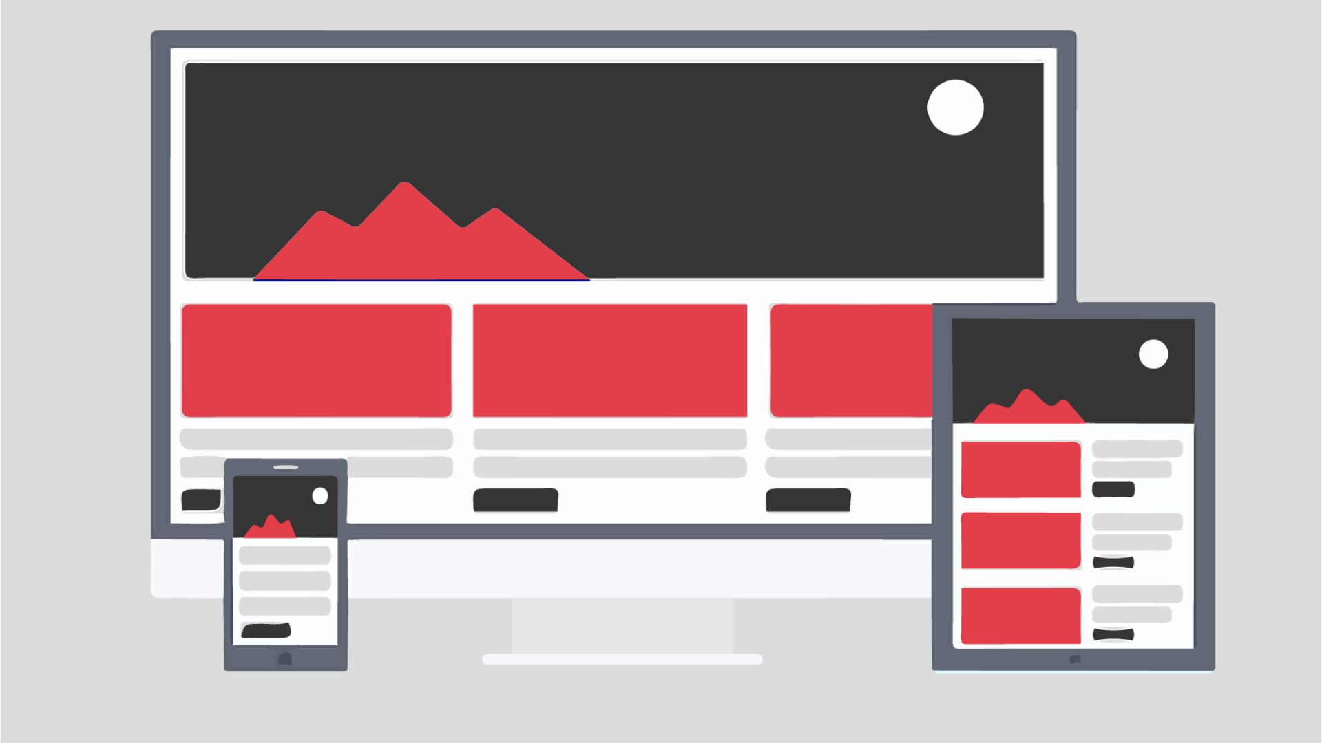
Most small business websites now get the majority of their traffic from mobile devices. That shifts everything about how trust signals need to be designed and prioritized — because a pattern that works beautifully on a desktop can completely collapse on a 390px screen.
On mobile, trust has to happen faster and in a smaller space. Visitors are often multitasking, running low on patience, and one thumb-swipe away from bouncing. The UI patterns that build trust on mobile are a compressed, prioritized version of what works on desktop — not a copy-paste.
What to prioritize above the fold on mobile:
- Your business name and what you do — in one clear sentence, not a tagline
- A tap-to-call button that's large enough to hit without pinching — this alone signals legitimacy to service-business visitors
- One micro-proof element — a star rating, a review count, or a single client name
- A single CTA — not two or three competing options pulling attention in different directions
What breaks mobile trust silently:
- Text that requires horizontal scrolling — it feels broken, not just inconvenient
- Modals or pop-ups that cover the full screen on arrival — on mobile, this reads as aggressive
- Touch targets that are too small — fumbled taps create friction and frustration, both of which erode confidence quickly
- Slow load times — mobile visitors on cellular connections are especially unforgiving here; a site that crawls signals neglect
If you're specifically designing navigation for mobile service sites, there's a lot more tactical detail worth reading on mobile-first navigation patterns for service websites.
Do Your Forms and CTAs Accidentally Signal Risk Instead of Safety?
Forms are where trust gets tested hardest. Asking someone for their name, email, phone number, or payment information is a moment of real psychological risk — and your UI either alleviates that risk or amplifies it. Most small business websites, without realizing it, design forms that feel risky rather than safe.
Here's the core principle: every field you add is a trust tax. Each additional input raises the perceived cost of proceeding. If your contact form asks for name, email, phone, company name, project budget, and 'how did you hear about us' — you've made the visitor do significant work before they've received anything in return. That imbalance signals you value your data collection over their time.
Trust-building form patterns:
- Ask for the minimum viable information — name and email is almost always enough to start a conversation
- Add a one-line reassurance near the submit button: 'We'll respond within one business day. No spam, ever.'
- Use clear, human-readable field labels — not placeholder text that disappears the moment they start typing
- Show inline validation in real time, with green checkmarks for correct entries — it makes progress feel rewarding rather than bureaucratic
- Drop the word 'Submit' from your button — it sounds like paperwork. 'Get My Free Quote' or 'Start the Conversation' performs better because it describes a benefit, not an action
CTA copy is its own trust signal. Buttons that describe an outcome — 'See How It Works,' 'Get Your Custom Plan' — feel lower-risk than generic commands like 'Buy Now' or 'Sign Up.' The more specific your CTA is about what happens next, the safer clicking it feels. Ambiguity is risk. Clarity is trust.
For a deeper look at this specific topic, the patterns behind form UX that actually increases submissions are worth exploring alongside this article.
Putting It All Together: A Trust Audit You Can Do This Week
You don't need to redesign your entire website to start applying these patterns. A focused audit of your current site — looking specifically through the lens of first-visit trust — can surface high-impact changes you can make quickly, often without touching code.
Work through each section honestly.
Header: Is your business name, primary service, and contact info visible without scrolling on both desktop and mobile? Can a stranger tell in under five seconds what you do and who you serve?
Hero section: Does your headline state a clear value proposition — not just a tagline? Is there one primary CTA, and does it describe a benefit rather than issue a command? Is there at least one proof element visible here — a rating, client count, or years in business?
Body content: Is your social proof specific, recent, and attributed to real people? Do your images show actual work or actual people rather than obvious stock? Is the visual hierarchy consistent — same font system, same button style, same spacing logic throughout?
Forms: Are you asking for the minimum information needed? Does your submit button describe an outcome? Is there a reassurance line near the submit action?
Footer: Does it include a physical address (even just your city and state), a current copyright year, links to your privacy policy, and at least one social media link? Does it feel complete, or like an afterthought?
Better yet — ask someone unfamiliar with your business to click through your site and narrate what they're noticing. The gaps they flag are almost always the same trust patterns described here. First impressions aren't just about design. They're about dozens of small signals that add up to a feeling your visitors either act on or walk away from.
Want to Know Exactly Which Trust Signals Your Site Is Missing?
We'll review your homepage and key landing pages through the lens of first-visit trust — your layout, social proof placement, form design, and mobile experience. It's a free, specific audit from a team that's been building credibility-first websites for US businesses since 2009. Reach out at Xulum.com with your site URL and we'll come back with real observations, not a sales pitch.
Request your quote →