What is UI Design?
User Interface Design (UI) is the discipline concerned with the visual and interactive appearance of digital products — everything the user sees, touches and interacts with in an application or website.
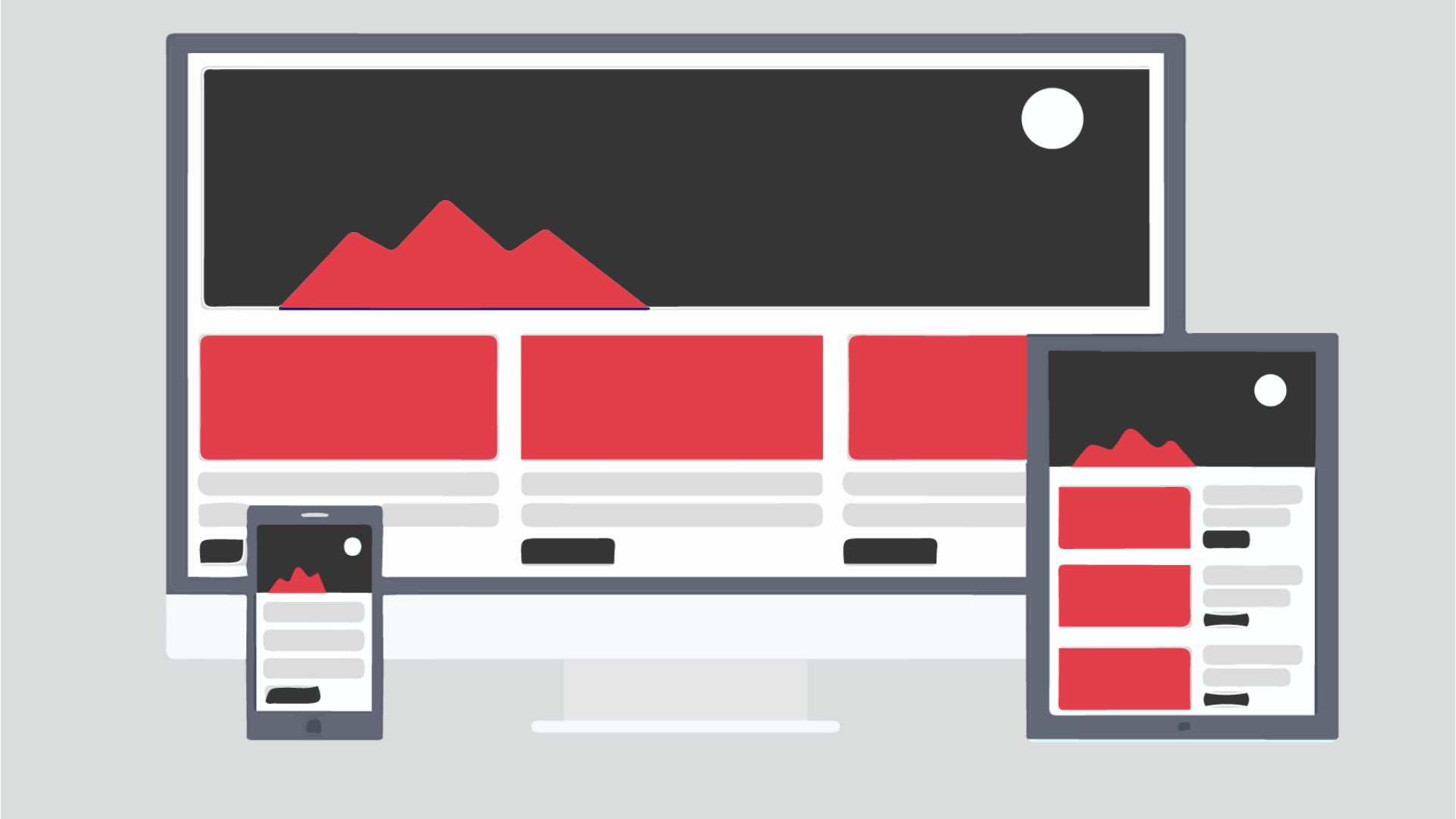
UI Design covers everything from the color of a button to the typography of headings, including icons, spacing, color palettes, animations and the overall visual consistency of the entire experience.
UI vs UX: What is the Difference?
This is one of the most common points of confusion in digital design. The difference is clear:
- UX (User Experience): focuses on HOW the product works — structure, navigation, user flows. It's strategic and problem-solving focused.
- UI (User Interface): focuses on HOW the product LOOKS — the visual layer the user perceives. It's aesthetic and communication focused.
A good analogy: in a house, UX is the architecture (where the rooms are, how you move around) and UI is the interior design (the colors, the furniture, the lighting).
Key Elements of UI Design
- Color palette: colors communicate emotions and create visual hierarchy. Each color has a psychological meaning that affects how users perceive your brand.
- Typography: the choice of fonts, sizes and spacing directly affects readability and the personality of your interface.
- Iconography: icons must be consistent, intuitive and accessible.
- Spacing and grids: white space is not wasted — it's an active element that improves readability and gives the interface room to breathe.
- Interactive components: buttons, forms, dropdowns, modals — all must have clear states (normal, hover, active, disabled).
- Images and illustrations: visual content must be consistent with brand identity and high quality.
Principles of Good Interface Design
- Consistency: the same elements must look and behave the same way throughout the interface. A Design System guarantees this.
- Visual hierarchy: guide the user's eye to the most important thing first. Size, color and contrast are your tools.
- Immediate feedback: every user action must have a visual response. A button that doesn't change when clicked creates uncertainty.
- Accessibility: design for everyone, including people with visual disabilities. The minimum contrast recommended by WCAG is 4.5:1.
- Simplicity: less is more. Every element you add competes for the user's attention.
Professional UI Tools
- Figma: the most widely used tool in the industry. Collaborative, cloud-based and with a robust plugin ecosystem.
- Adobe XD: good integration with the rest of the Adobe ecosystem.
- Sketch: very popular among iOS/macOS teams.
- Framer: allows creating prototypes with complex interactions and real code.
UI Trends in 2024
- Glassmorphism 2.0: frosted glass effects with better accessibility than the previous version.
- Dark Mode: no longer optional — it must be part of the design from the start.
- Enhanced micro-interactions: subtle animations that bring the interface to life and communicate state.
- Variable typography: fonts that dynamically adapt based on context.
- AI-assisted design: tools like Figma AI or Galileo AI to generate components automatically.
Need a professional interface design?
At Xulum we design attractive, functional interfaces centered on your users' experience.
Get in touch