What a Tourism Website Actually Needs to Drive Bookings
A tourism website has to do three things fast: build trust, spark desire, and get out of the way of the booking. Travelers decide within seconds whether an experience feels worth their money. Slow load times, generic visuals, a buried 'Book Now' button — any one of those is enough to lose someone who was genuinely interested.
That's the short version. The execution is where most tourism businesses come apart.
Tourism is an emotion-first purchase. Nobody books a whale-watching tour or a boutique vineyard stay because a feature list convinced them. They book because your site made them feel something. That means photography and video aren't decorative — they're doing the selling. High-resolution, authentic imagery of real experiences beats stock photos of generic beaches every time. This isn't a creative preference; it's a conversion issue.
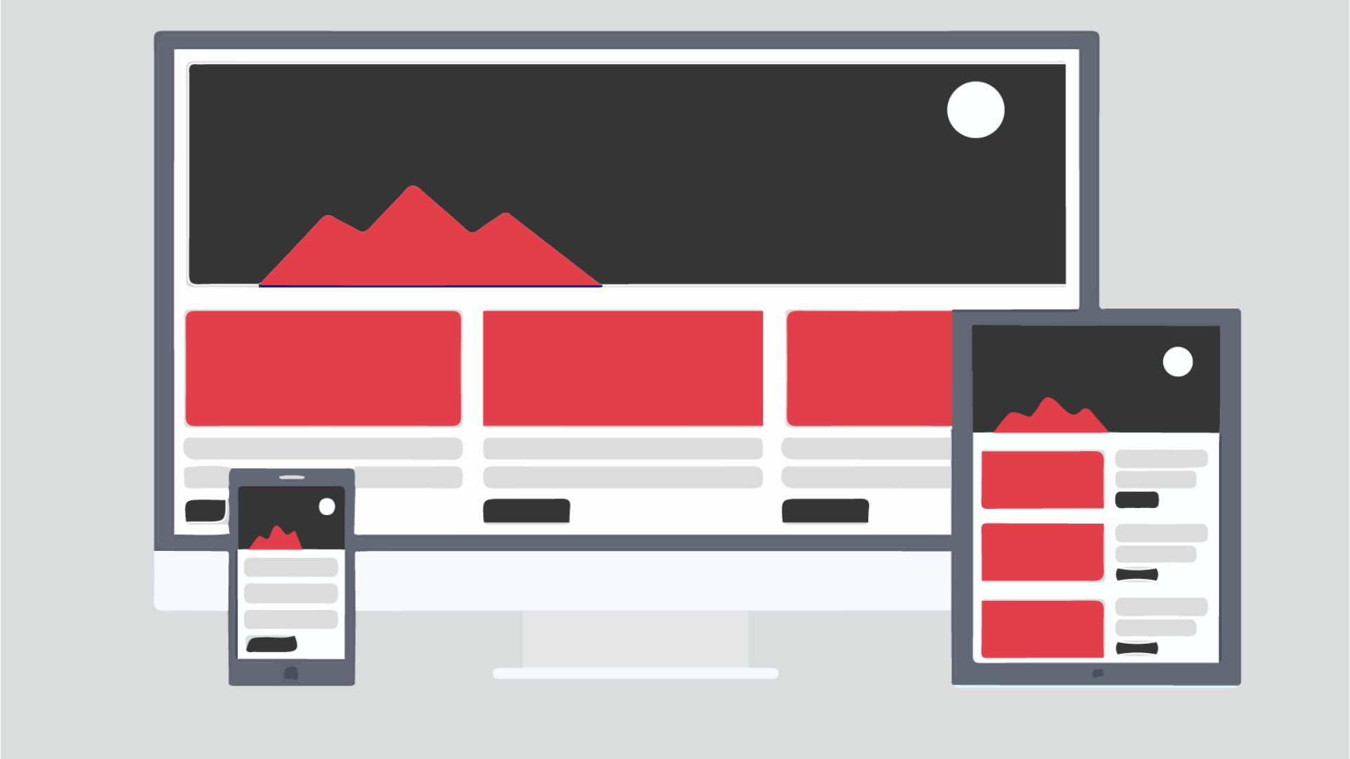
Mobile performance matters more in travel than in almost any other vertical. A huge share of trip research happens on phones — during a commute, a lunch break, a late-night browse. A clunky mobile experience kills that impulse before it becomes a booking. We've watched clients cut their bounce rate meaningfully just by compressing image assets and restructuring mobile navigation. No redesign. Just smarter build decisions from the start.
Trust signals also have to be woven into the layout — not stuffed into a footer. Reviews, certifications, clear refund policies, real contact information. Travelers are handing over money for something they can't physically inspect before arrival. Reducing that perceived risk is a design problem as much as a marketing one.
The Design Mistakes That Are Quietly Killing Tourism Conversions
Most tourism websites share the same handful of problems. They're worth naming directly.
- Generic homepage hero: A rotating banner of stock photography with taglines like 'Discover the World' tells visitors nothing useful. Your hero section should answer 'What do you offer, where, and for whom?' in under five seconds.
- No clear booking path: Users shouldn't have to figure out how to reserve. The call-to-action — whether it's a booking widget, a reservation form, or a 'Check Availability' button — needs to be persistent and obvious, especially on mobile.
- Itinerary pages that read like brochures: Vague, enthusiastic paragraphs don't help travelers make decisions. Structured content — departure times, group sizes, what's included, what's not — converts far better than flowery copy.
- Ignoring page speed: Tourism sites are image-heavy by nature. Without proper optimization — modern formats, lazy loading, a solid CDN — load times drag. Slow pages cost you rankings and customers.
- No social proof above the fold: If a visitor has to scroll deep to find reviews, many won't. Integrate testimonials and aggregate ratings near the top, particularly on tour and package landing pages.
- Weak local SEO setup: Many small operators have no Google Business Profile, inconsistent NAP data, or destination pages with no geographic keywords. That's easy organic traffic left on the table.
A pattern we keep running into: clients who invested in beautiful custom designs that still underperformed — because nobody thought through the information architecture before a single pixel was placed. A visually stunning site with a confusing user journey is just expensive wallpaper.
What Does Great UX Look Like for a Travel or Tour Website?
Great UX in tourism isn't about following a trendy design system. It's about matching how travelers actually research and decide. Here's what that looks like in practice.
Search and filter tools that work: If you offer multiple tour types, destinations, or date ranges, users need to find the right option without scrolling through your entire catalog. A well-built filter experience reduces friction and helps travelers self-qualify — so the people who reach your booking form are already warm and ready to commit.
Dedicated landing pages per experience: Instead of one generic 'Tours' page, strong tourism sites build separate pages for each experience or location. A rafting company in Colorado should have distinct pages for half-day trips, full-day trips, and multi-day expeditions — not one page that vaguely mentions all three. It serves users better and gives search engines something specific to index.
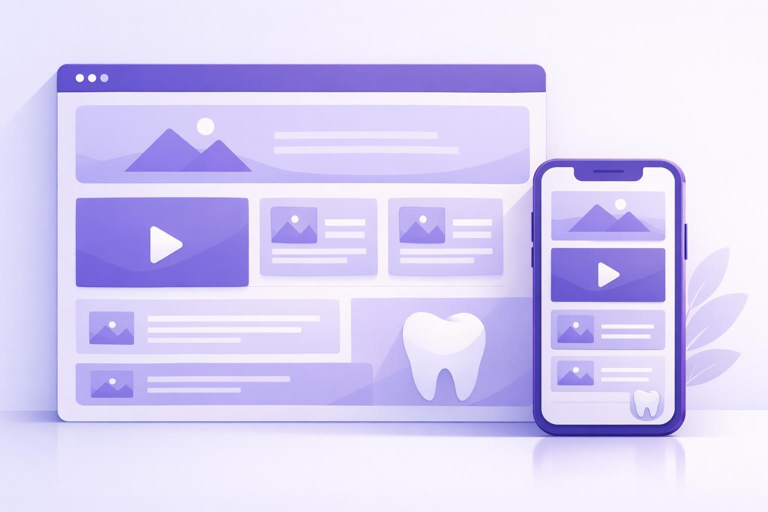
Visual storytelling in the right format: Short video clips — under 90 seconds, embedded natively, never auto-playing with sound — tend to outperform static galleries for emotional impact. They do need to load fast and never block the rest of the page from rendering. Both matter equally.
An integrated booking or inquiry flow: Whether you're using a third-party engine like FareHarbor or Checkfront, or a custom form, the handoff from 'I want this' to 'I've reserved this' has to feel consistent and on-brand. Dropping users onto a third-party page that looks nothing like your site creates hesitation right at the moment of conversion — the worst possible time to lose someone's confidence.
If you're thinking about how site structure affects other service-based businesses, our piece on web design for law firms covers overlapping principles around trust-building and conversion architecture that translate well across industries.
SEO and Content Strategy Built Into the Design, Not Bolted On
Tourism is one of the most competitive spaces in organic search. Going up against Tripadvisor, Expedia, and well-funded travel blogs means a small operator has to be strategic. The good news: local and niche queries are still very winnable — if the site is built with that in mind from day one.
- URL and page structure: Design the site architecture around keyword clusters, not internal convenience. A URL like
/tours/sedona-jeep-toursbeats/experiences/category/5every time — for users and for search engines. - Schema markup: Tourism sites should implement structured data for events, tours, reviews, and FAQs. It improves how listings appear in search results and lifts click-through rates without directly touching your rankings.
- Location-specific content: Pages targeting 'things to do in [city]' or '[activity] near [landmark]' can capture high-intent travelers who are actively planning. These work when they're genuinely useful — real itineraries, seasonal tips, honest logistics — not thin filler dressed up as content.
- Internal linking between experiences: A visitor reading about a kayaking tour might also want a camping add-on. Strategic internal links keep users exploring and tell search engines which pages carry the most weight.
- Core Web Vitals compliance: Google's page experience signals reward sites that load fast, respond to interaction quickly, and don't shift layout as content loads. For a tourism site competing in organic search, these aren't optional.
SEO built into the design phase is always cheaper and more effective than retrofitting it post-launch. By the time you're untangling URL structures and patching missing metadata on a live site, you've already paid for the work twice.
Do Tourism Companies Need a Custom Website or Will a Template Work?
This is the question we hear constantly. The honest answer: it depends on your booking complexity, your volume, and how much your brand needs to stand apart from competitors who are selling similar experiences.
A template-based build on Squarespace, Webflow, or WordPress can be entirely appropriate for a small operator with one or two core offerings and a straightforward booking flow. Done well, it can be fast, mobile-friendly, and conversion-optimized. The constraint is flexibility. When you need a specific user flow, a custom booking integration, or a design that genuinely cuts through a crowded market, templates start showing their limits quickly.
Custom development makes sense when:
- You have multiple tour types with complex availability and pricing logic
- You're integrating with an enterprise booking platform that needs a branded wrapper
- Your competitive advantage is visual — luxury, boutique, or experiential brands where design is part of the product itself
- You're scaling and need a CMS your team can manage without a developer on call
What we'd push back on is the assumption that 'custom' automatically means better. We've seen beautifully built custom sites that were slow, hard to maintain, and impossible for the client's team to update. The goal is a site that serves your business — not one that impresses other designers. That distinction shapes every recommendation we make, which is also why our broader web design services for businesses across industries start with strategy before any wireframe gets drawn.
Why Tourism Brands Are Turning to Nearshore Agencies for Web Projects
The conversation about where to build your tourism website has shifted. US-based operators — boutique adventure outfitters in the Rockies, wine tour companies in Napa, eco-lodges in the Southwest — are increasingly looking beyond local agencies. Not because local talent isn't good, but because the value equation has changed.
Nearshore agencies based in Latin America work in US time zones. That matters more than it sounds. You get senior-level expertise, real-time collaboration, and pricing that reflects lower operational costs — without the communication gaps that come with teams twelve hours ahead of you.
For tourism clients specifically, a few things really do separate a capable agency partner from one that looks good on paper:
- Visual design fluency: Tourism is a design-driven category. You need a team that knows how to art-direct imagery, build visual hierarchy, and create emotional impact — not just execute a brief mechanically.
- Technical range: Booking widget integrations, schema markup, performance optimization — tourism sites have specific technical requirements. An agency with full-stack capability handles all of it without awkward handoffs between separate vendors.
- Ongoing availability: Tourism businesses are seasonal. When you need a landing page updated before peak season or a promotion live by Friday, you need a team reachable during your business hours. With a nearshore setup, that's not a negotiation.
At Xulum, we've been building digital experiences for US and international clients since 2009. Tourism brands are some of our most rewarding work precisely because the stakes are tangible — a well-designed site doesn't just look good, it fills tour slots and grows the business. We understand both sides of that equation.
Let's Take a Hard Look at Your Tourism Site
Not sure whether your current site is pulling its weight — or starting from scratch and want to get it right the first time? Let's talk. We'll review your site, your booking flow, and your goals, then give you an honest read on where the real opportunities are. No pitch decks, no obligations. Just a focused conversation about your business.
Request your quote →