What Makes a CTA Button Actually Convert?
A CTA button converts when it's visually distinct, uses action-oriented copy, and lands where the user already wants to move forward. Color contrast, button size, surrounding whitespace, and the exact words on the button all work together. Get any one of those wrong and users scroll past without a second thought.
That might sound simple. But most small business sites we audit are tripping over the same handful of issues: buttons that blend into the background, generic labels like "Submit," and placement that feels like an afterthought. These are fixable problems — and fixing them doesn't require a full redesign.
The sections below break down each variable — color, copy, placement, shape, and mobile behavior — so you can evaluate your own buttons against a practical checklist rather than guessing. If you want to understand how button design fits into your site's broader interface, our guide to professional UI design for small businesses covers the bigger picture.
Color Contrast: The Single Fastest Win
Here's the honest truth about CTA button color: there's no magic hue. It's about contrast with everything around it. A green button on a green hero image is invisible. That same green button on a white background with plenty of breathing room? It pops.
- Use your brand's accent color — not your primary palette — for primary CTAs. The button should feel on-brand without competing with everything else on the page.
- Check contrast ratios. WCAG accessibility guidelines require a minimum contrast ratio of 4.5:1 for normal text. Free tools like WebAIM's Contrast Checker will tell you instantly whether your button label passes.
- Limit your primary button color to one use per screen. When everything is highlighted, nothing is. We've watched clients ship landing pages with three different "primary" button colors — users genuinely didn't know where to look first.
- Test dark mode. If a meaningful share of your audience visits after hours on mobile, a button that looks great in light mode can become nearly invisible in dark mode if you haven't accounted for it.
One practical starting point: open your homepage in grayscale — most operating systems have an accessibility shortcut for this. If your CTA button disappears into the page, contrast is your first problem to solve.
Why "Submit" Is Quietly Killing Your Conversions
Button labels are micro-copy, and micro-copy does a lot of heavy lifting. The difference between "Submit" and "Get My Free Quote" is the difference between a transactional dead-end and a value exchange. Users want to know what happens after they click — give them that answer on the button itself.
Action-first phrasing consistently outperforms passive labels across every category we've worked in, from local service businesses to SaaS products. The formula is straightforward: start with a verb, follow with a specific outcome.
- Weak: Submit, Click Here, Learn More, Go
- Stronger: Get My Free Estimate, Start My Trial, Book a 15-Minute Call, Download the Guide
First-person phrasing — "Get My Free Quote" instead of "Get Your Free Quote" — has been debated in the CRO community for years. The evidence is mixed, but the underlying principle holds: the copy should feel tied to the user's outcome, not describe an action they have to perform.
Keep it short. If a label runs past four or five words, it usually signals that the surrounding copy isn't doing its job. The button should be the punctuation mark at the end of a sentence the page already wrote.
Where You Put the Button Matters as Much as How It Looks
Placement is a context problem, not a position problem. "Above the fold" gets cited as the golden rule constantly, but that advice is incomplete. A CTA placed before the user has enough information to say yes is a CTA that gets ignored.
Think about the decision the user needs to make. For a simple, low-commitment action like signing up for a newsletter, above the fold works fine. For a service that costs several thousand dollars, users need to scroll, read, and get comfortable before they're ready to act. Forcing a call to action too early can actually create friction — it signals that you're more interested in capturing a lead than solving their problem.
Practical placement guidelines for small business sites:
- Place a primary CTA in the hero section for low-commitment offers.
- Repeat the CTA after your key proof points — testimonials, case studies, or a feature comparison.
- Add a sticky CTA bar or floating button only after users have scrolled well down the page. Interrupting them earlier is annoying, not persuasive.
- Every major section break is a natural resting point where a well-placed CTA can catch users who are ready to move.
For e-commerce specifically, product pages have their own rules — if that's your context, the article on e-commerce UI design that converts is worth reading alongside this one.
Size, Shape, and Whitespace: The Details Designers Sweat
Button size should be proportional to its importance. Your primary CTA should be the most visually prominent interactive element on the page — not the biggest thing on the page, but clearly the most clickable. Secondary actions like "Learn More" or "See Examples" should be noticeably smaller or styled as ghost buttons so the hierarchy is obvious at a glance.
Shape: Rounded corners have become the dominant convention on the modern web, and there's a reason for that — they read as friendlier than sharp corners, which tend to feel more formal. That said, sharp corners aren't wrong. A legal services firm or financial advisor might find the harder edge actually fits their brand voice. The real rule is consistency: pick a shape and stick with it across your button system.
Whitespace around the button: This is the one most site owners overlook. A button crowded by adjacent text or images loses visual priority fast. Give your primary CTA enough breathing room that the eye lands on it naturally. We often ask clients to look at their page from across the room — if they can't immediately spot the button, it needs more space.
Minimum tap target size: For mobile, Google and Apple both recommend a minimum tap target of 44x44 pixels. A button that's technically clickable but practically impossible to tap without zooming is a conversion killer on smartphones.
Mobile CTA Design: What Breaks on Small Screens
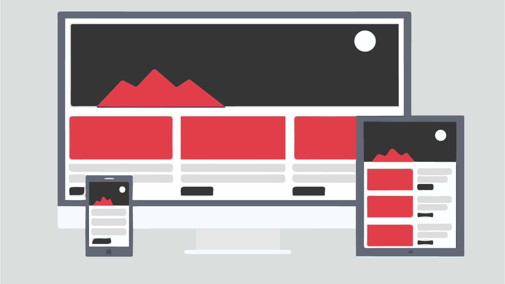
A pattern we keep running into: teams design for desktop first, then try to scale down — and the mobile experience pays for it. CTA buttons behave very differently on a 390-pixel-wide phone screen than they do on a monitor, and the problems compound quickly.
Common mobile CTA failures we see in audits:
- Buttons that are full-width on desktop become awkwardly small when stacked vertically on mobile because the layout didn't adapt.
- Sticky headers with a CTA overlap the main content, blocking text and frustrating users who are trying to read.
- Hover states — a staple of desktop button design — don't exist on touch screens. If your button only reveals its active state on hover, mobile users never see it.
- CTA copy that fits neatly in one line on desktop wraps to two lines on mobile, breaking the visual rhythm and sometimes truncating the label entirely.
The practical fix is to design your button system mobile-first. Start at 390px wide, get the button right there, then scale up. It forces better decisions about font size, padding, and label length from the start rather than patching problems at the end.
Secondary CTAs: Helpful or Distracting?
Secondary CTAs give users an alternative path when they're not ready for the primary offer. On a SaaS landing page, the primary CTA might be "Start Free Trial" while the secondary is "Watch a 2-Minute Demo." Both are valid outcomes — but only if the visual hierarchy makes it obvious which one deserves attention first.
The risk is what conversion optimizers call "the paradox of choice." Too many equally weighted options cause hesitation, and hesitation leads to abandonment. Here's how to use secondary CTAs without undermining your primary goal:
- Visually subordinate them. Ghost buttons, text links, or smaller filled buttons in a muted color all signal "secondary" without hiding the option.
- Limit secondary CTAs to one per primary CTA. Two alternatives is a choice. Three or more is a menu.
- Match the secondary CTA to where the visitor is in their decision. If someone landed from a cold social ad, they're probably not ready to book a call — a "See Our Work" secondary CTA serves them better than "Read the Terms."
For small businesses especially, keeping that primary-to-secondary ratio clear matters. You often don't have the traffic volume to recover from a decision architecture that splits attention too many ways.
How to Know If Your CTA Buttons Are Actually Working
Gut feel isn't a testing strategy. If you have enough traffic to run an A/B test — and many small business sites don't hit that threshold as quickly as people expect — test one variable at a time. Start with button label copy before you touch color. Copy drives intent; color drives attention. Getting the words right first gives you a stronger baseline to build from.
If your traffic is too thin for statistically meaningful A/B tests, qualitative research fills the gap:
- Session recordings (tools like Hotjar or Microsoft Clarity have free tiers) show you where users hover, where they hesitate, and where they drop off. A button users hover over and then abandon tells a very different story from one they never engage with at all.
- Heatmaps reveal whether users are even seeing your CTA. If click concentration is clustering somewhere other than your primary button, the page hierarchy is misleading them.
- Five-second tests — show someone your homepage for five seconds, then ask what the main action is. If they can't answer quickly, your CTA isn't prominent enough.
We've worked with clients who were convinced their button color was the culprit when the real issue was that the surrounding copy wasn't building enough trust for any button to convert well. Start with context — is the page doing its job? — before obsessing over the button in isolation.
Get a Free CTA Audit for Your Site
If you read this and immediately thought of a button on your site that's probably underperforming — you're likely right. At Xulum, we review CTA design, button hierarchy, and conversion flow as part of a focused UI audit. No fluff, just specific feedback on what's working and what isn't. Request your free audit and we'll take a look at your site and tell you exactly where your buttons are leaving money on the table.
Request your quote →